GLO Tea Lantern: Product &
Packaging Design
Role: Concept, Construction, Typography, Graphics, Layout
This conceptual project puts forth a product that brings the comfort of candle lighting to the outdoors in a safe, eco-friendly, and affordable manner.
With this product, I sought to create something that would bring a sense of luxury and sophistication to the camping experience, without being exorbitantly expensive or otherwise unapproachable. The conceptual brand, Glo Camping Outfitters, specializes in environmentally friendly alternative lighting and outdoor gear.


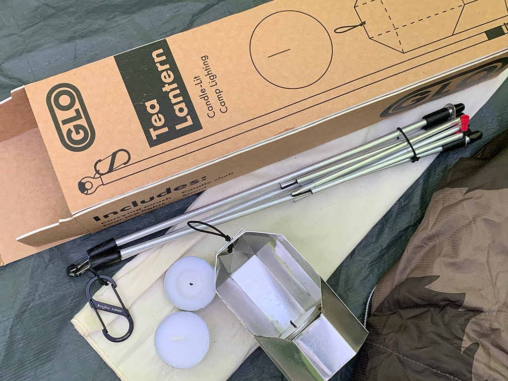
Pictured on the left are matte board models of the candle shell in action and the template for the shell drawn on a sheet of aluminum before it was cut.
Realizing my vision with this project required lots of sketching, modeling, tinkering, building, and trial and error. Many trips to REI, art stores, and hardware stores were made during the creation process. Working with unfamiliar materials in such a hands-on meduim made this project a constant learning process, but all of the drafting led to a successful and functional final product.
Realizing my vision with this project required lots of sketching, modeling, tinkering, building, and trial and error. Many trips to REI, art stores, and hardware stores were made during the creation process. Working with unfamiliar materials in such a hands-on meduim made this project a constant learning process, but all of the drafting led to a successful and functional final product.
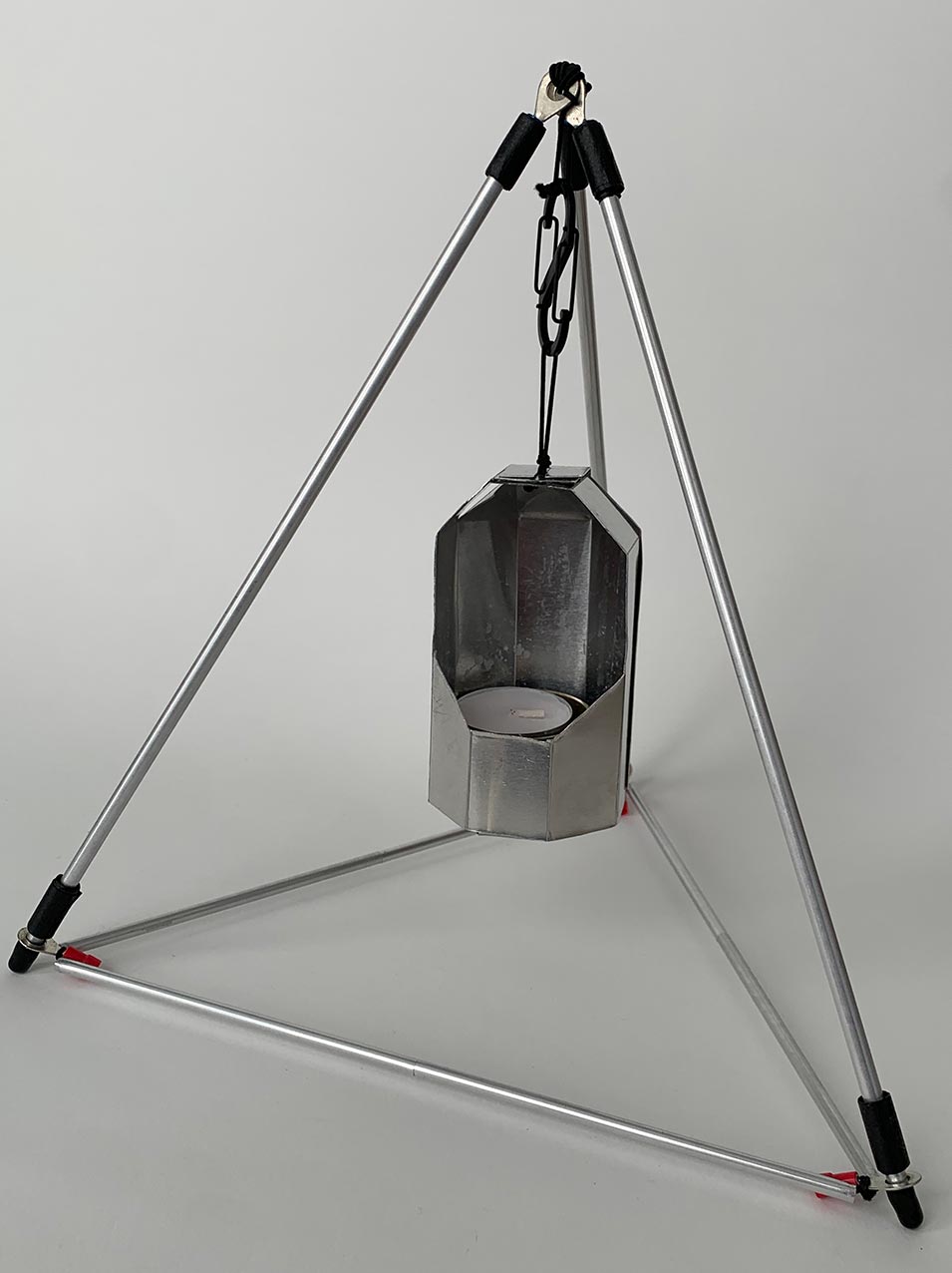
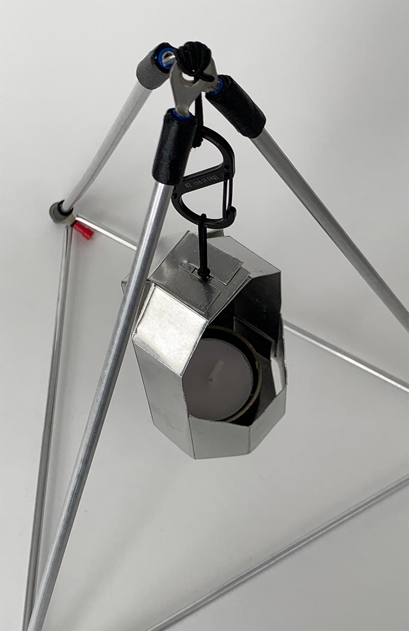
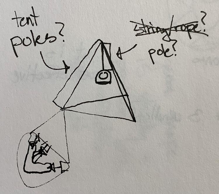
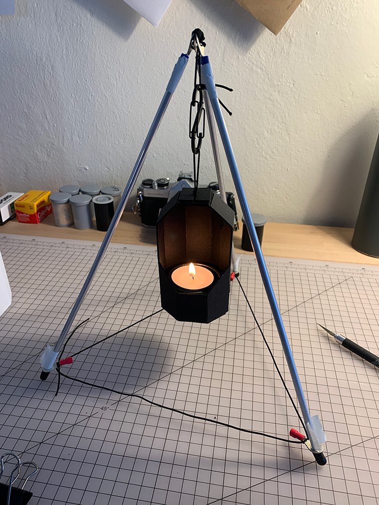
The rigid triangular form of the stand provides stability, while the foldable “tent pole” style bottom rods increase portability.
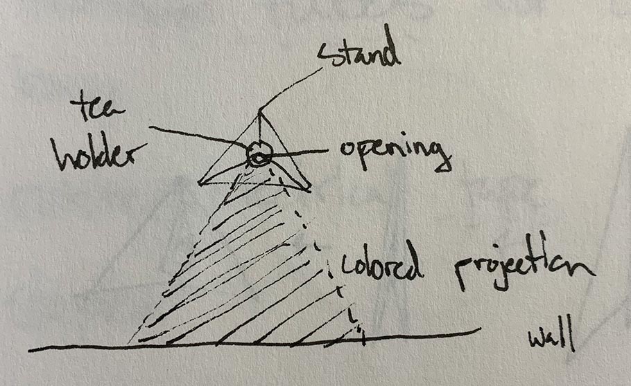
The geometric form of the shell serves to amplify the candle light by reflecting it around the polished aluminum surface before directing it outward through the opening.
Tea candles were chosen for their inexpensive price point, relatively small flame, and wide base, reducing the possibility of burns or leaking wax.
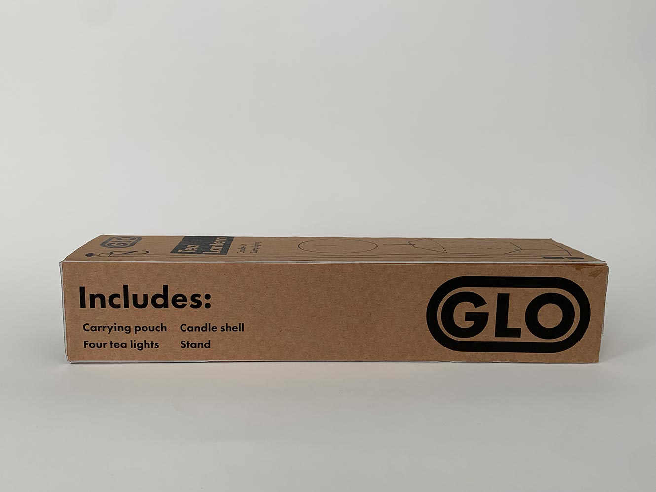
Black ink and Kraft paper packaging plays into the brand’s minimal and environmentally friendly identity.
The industrial and futuristic form of the product is echoed by simple, geometric graphics and a sharp sans-serif typeface.
The geometric form of the shell serves to amplify the candle light by reflecting it around the polished aluminum surface before directing it outward through the opening.
Tea candles were chosen for their inexpensive price point, relatively small flame, and wide base, reducing the possibility of burns or leaking wax.
Black ink and Kraft paper packaging plays into the brand’s minimal and environmentally friendly identity.
The industrial and futuristic form of the product is echoed by simple, geometric graphics and a sharp sans-serif typeface.